Projects
Mobile App Design for Circular Kitchen
Group Project | Duration : 10 weeksDesign Goal: To design a user experience to create support for sustainable consuming behaviours from the Kitchen ID mobile application.
This research project was initially started at Chalmers University by Ulrike Rahe, a professor in Industrial Design,
and her colleagues. Our aim was to provide an interactive solution adapts to a circular kitchen service and enables
users to efficiently manage the recirculation of their furniture. Thus, this project involves designing an app that
offers a platform to manage the kitchen with an ability to easily identify and track various kitchen components and
repair, recycle, and sell them. Furthermore, this project was completely executed online due to Covid-19 pandemic and was done
by a group of 3 people including myself.
Methods
My role and responsibilities
- Conducted secondary research on kitchen furniture industry, barriers to kitchen circularity, emotional durability and product attachment and also identifed industry stakeholders.
- Brainstormed ideas for possible user groups and created one of the personas represented below.
- Create a scenario and the user journey map for that persona.
- Proposed the idea of creating information architecture to ease the process of prototyping and identify the application flow.
- Designed about 9-10 screens for both Low and High fidelity prototypes.
- Designed an evaluation workshop for usability test to get an open feedback from the users.
Design Process

Phase 1
Analyse
This phases mostly focused on gathering requirements, researching similar existing apps and also understanding the circular
kitchen cycle as seen in the picture below.
What we learnt?
We learnt that for several of the households, renovation was seen as a necessity for being able to enjoy using the kitchen. Moreover, this research helped to
understand various barriers for kitchen circularity like problems with kitchen ageing and, poor quality and the difficulty in repairing kitchen appliances and
furniture. Furthermore, important factors considered as a part of circular kitchen were learnt which were emotional values,
design for attachment and trust, design for reliability and durability of the system.
As this project also involves a scanning and tracking technology , a research on technologies like Barcode and RFID was conducted. Considering the user perspective of
easily scanning the kitchen cabinets and individually identifying
them, it was thought to be most optimal to have an RFID tag for each cabinet.
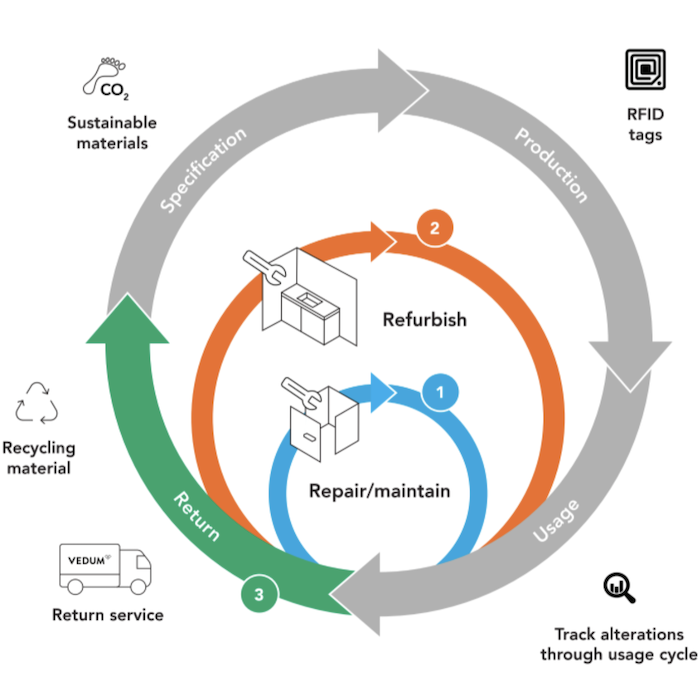 Credits: This picture is originally retrived from Ulrike Rahe
Phase 2
Define
Having the ethnographic data from the literature review, we decided to use personas &
scenarios to transfer the data into user models who represent the main classes of targeted users.
Further, in order to demonstrate the possible solutions of each persona’s needs and scenarios,
storyboards were created to represent the design thinking. And finally, based on the scenarios we have,
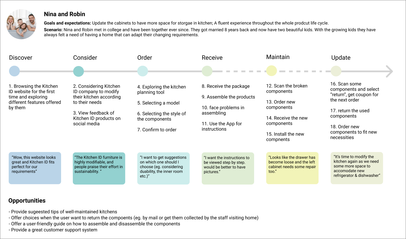
we walked through one of the persona's journey of using Kitchen ID app, trying to dig into the positive,
negative as well as neutral moments as they interact with the app over a period of time.
Personas
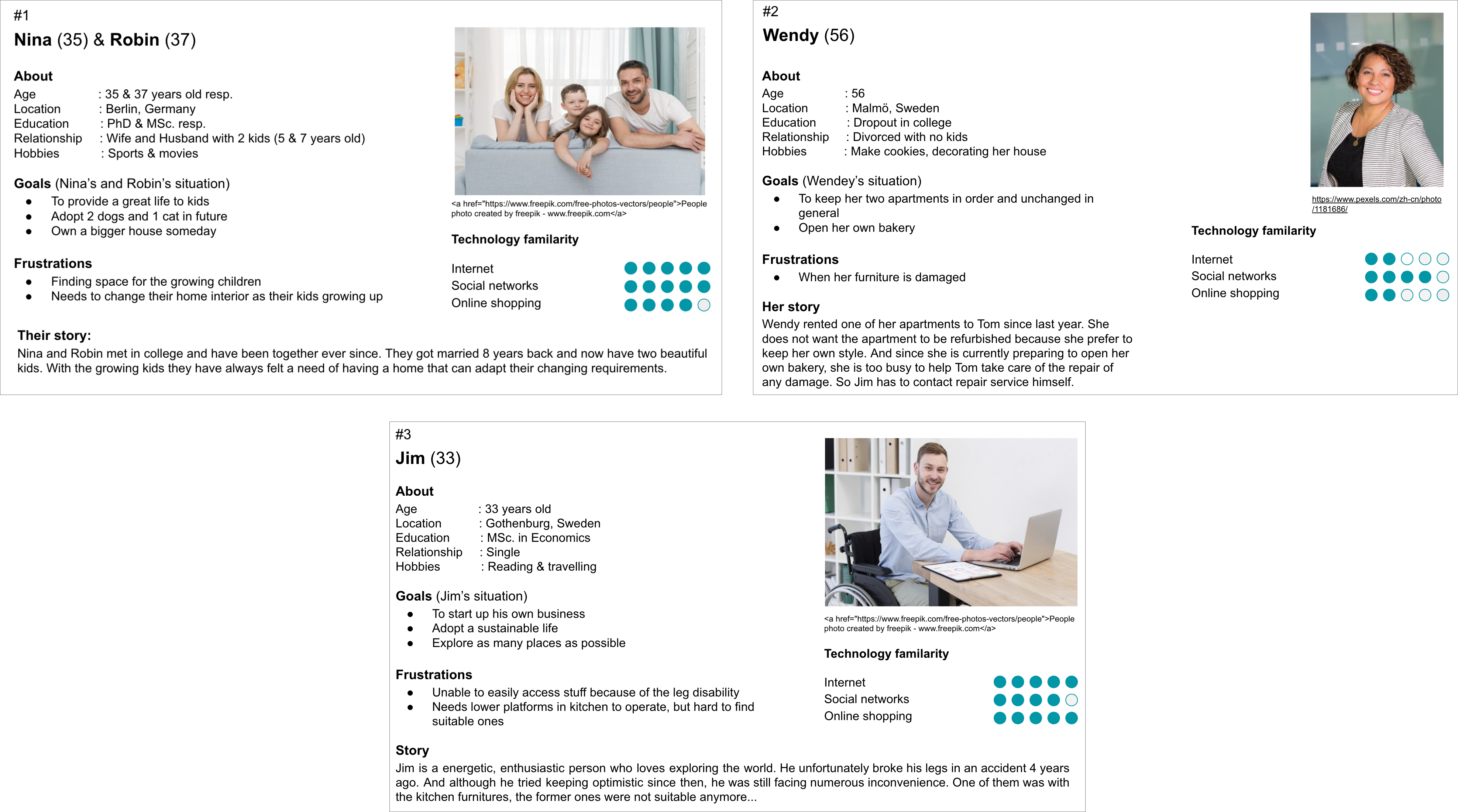
Personas were defined based on the insights generated from the literature review. By formalizing the behavior patterns of our target users,
we hoped to systematically construct patterns of interaction that smoothly match the behavior patterns, mental models, and goals of users.
Three personas were created, thoroughly selected from all 11 personas in the brainstorming, they are three representatives of different user
groups who have different needs and purposes in app usage. In each persona board, detailed information from the age to the persona’s life goal is
displayed. Notably, we mentioned the user’s frustrations about their current kitchens to reflect their demands and needs. The scenarios employed
personas as main characters to generate design solutions in an iterative, repeatable, and testable fashion.
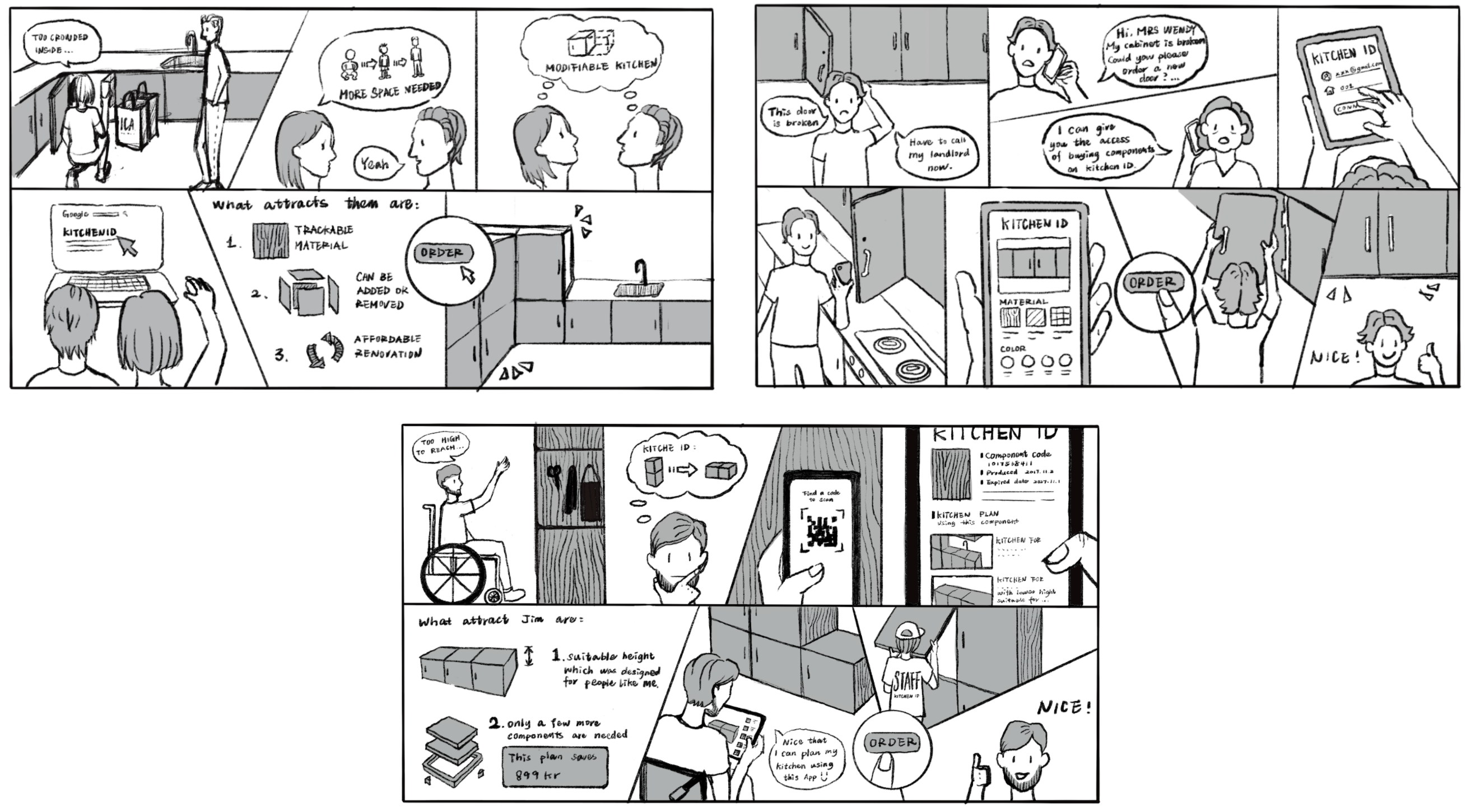
We discussed what could happen in each persona’s story in real life and wrote down the script of three storyboards. Then we produced the illustrative outcomes and did a few adjustments based on team members feedback. The storyboards helped us determine several interesting features that can be attractive to our target users. These features were initial and rough in this phase and in the following iterations they evolved a lot.
After digging into the positive, negative and neutral moments of users, we found some opportunities for designing new features for the app. For example, to provide well-designed kitchen tips for inspiration, to offer a user-friendly guide on how to assemble and disassemble the components, to provide a great customer support system, etc. What we pictured in mind was that this app is more than just a tool, but a close partner in managing, maintaining, and renovating the kitchen.
Phase 3
Ideate
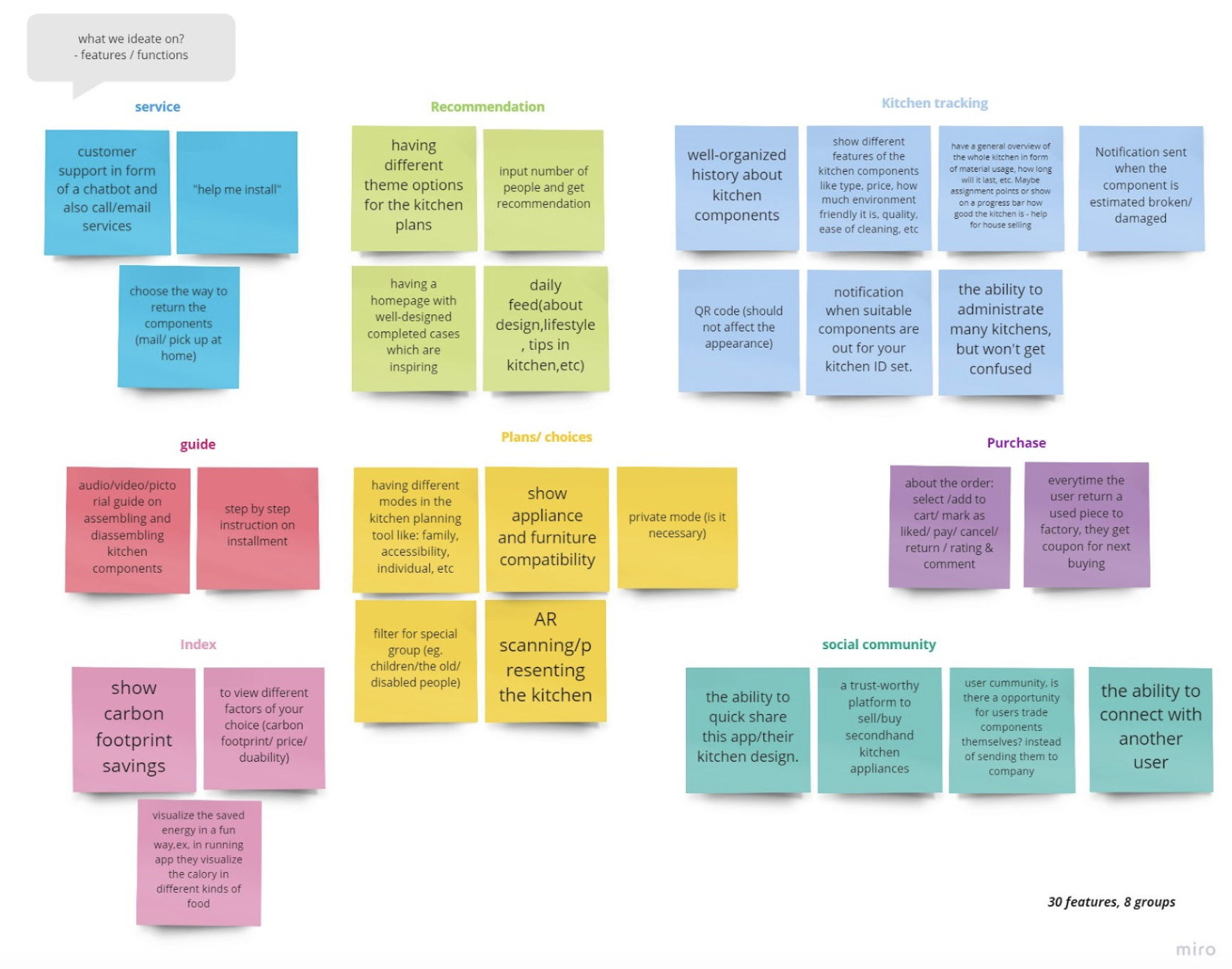
Based on the initial design materials we have, we started to brainstorm about features we can have on this app. By using the KJ technique , we sorted
our ideation notes into 8 groups - service, recommendation, trace and tack, guide, plans/choices, purchase, sustainability index, and social community. At this
stage, we thought about different technical features like AR, image recognition, RFID detection, etc. We selected the most vital features we wanted to keep in the
App according to the user and stakeholder needs and focus on further developing them.
Subsequently, we made a UX table that transforms user tasks to UX goals. UX table is an adaptive version of the UX target Table which is a spreadsheet demonstrating the work role and related user class to
which this UX target applies, the associated UX goal, and the UX measure . We simplified this table by only keeping the columns of UX goals, User class to better use it as an ideation tool in the early design phase.
Phase 4
Prototype
Information Architecture
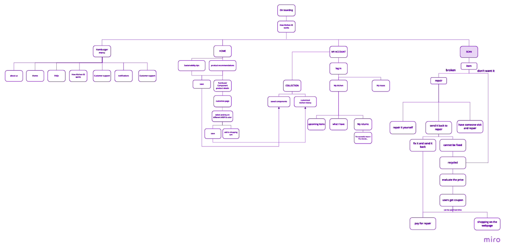
Before beginning the actually wireframes, we wanted to make sure that we agreed on the priority of different features and the user flow, which
is why we created an information architecture. At this stage we made a trade-off between features and steps, as well as came up with the sequence of interfaces.
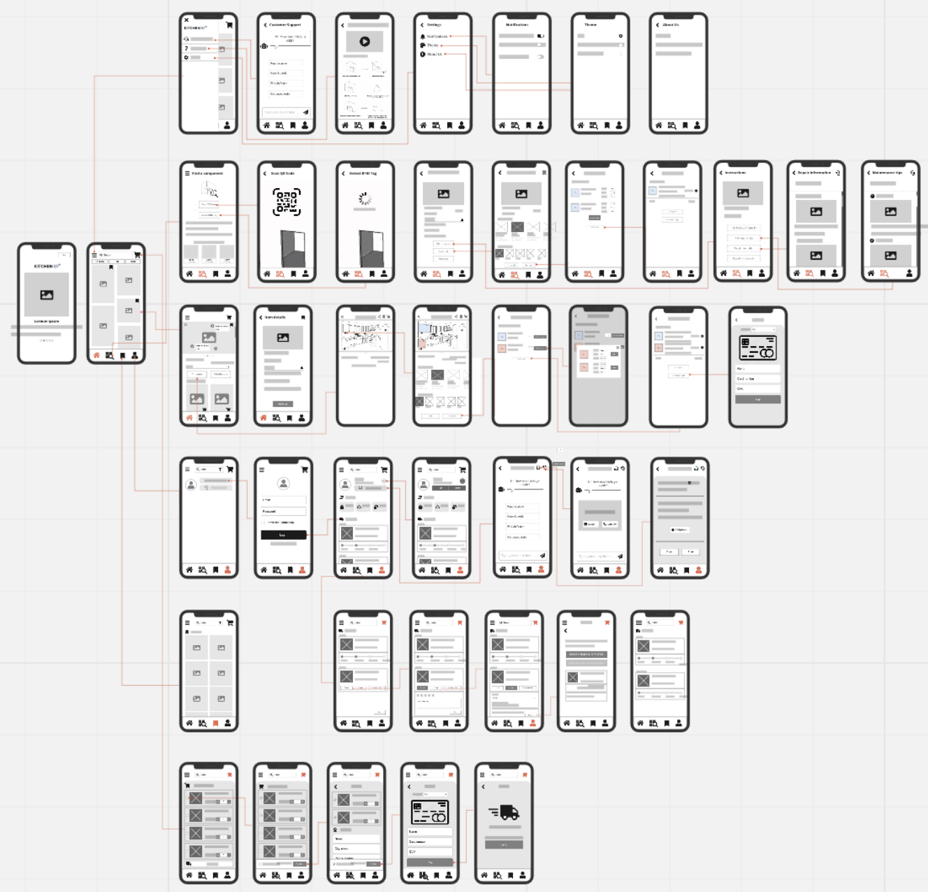
While prototyping we mainly considered if the flow works for completing the tasks. Different sub-classes of users were taken into consideration when designing the prototype. For instance, we designed the recommendation feature with content about well-designed kitchen plans to nudge novice users to get interested in our brand and thus to purchase our furniture. This version of the low fidelity prototype emphasizes the webshop functionality strongly. The most challenging part of this process was designing for the kitchen customization planner as we had to keep the complexity to a minimum and good usability to the maximum.
However, the design made a huge turn in the second version after the feedback workshop and discussion with our supervisors focus shifted from the purchasing flow to the maintenance and management flow. Therefore, we shifted the focus to reduce consumption behaviour and encourage sustainability. At the same time, we repositioned this app to accommodate the needs of users who are currently using the Kitchen ID furniture, but not new users who are planning to buy new kitchen furniture.
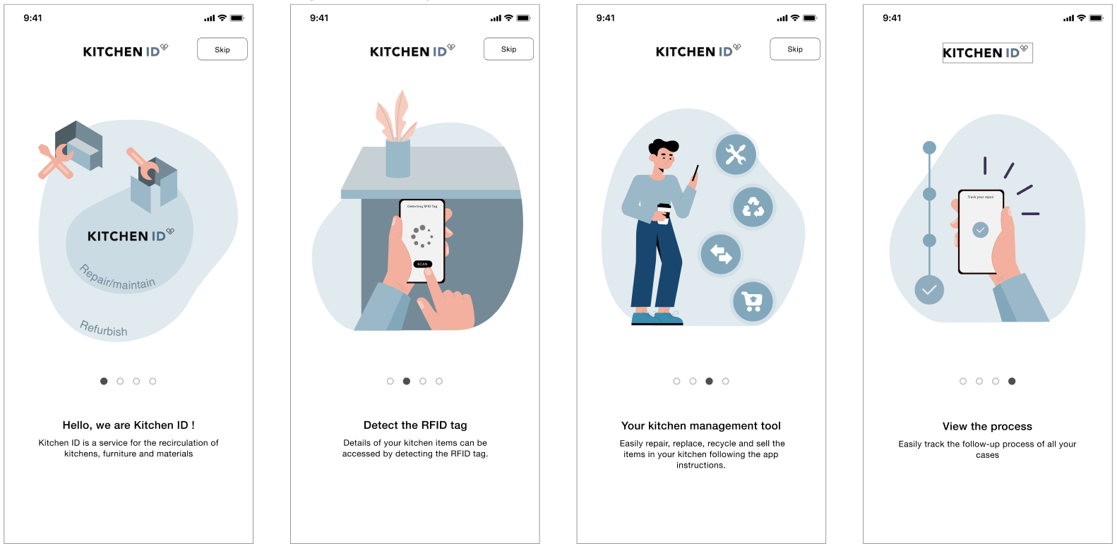
Three iterations of high fidelity prototype were conducted during the design process. In the first iteration, we experimented with different interface design, component design, font, and color themes to find the best solution. By actively discussing various options we created and checking on the Human Interface Guidelines(Apple, 2020), we finally determined the components design such as buttons and input box, and preliminary interface structure for each main feature.
In the second iteration, we mainly worked on refining each screen based on the design rationales demonstrated by Cooper et al.(2014). For instance, using rich visual modeless feedback by giving in-depth information about the status or attributes of a process. Status and attributes are readily displayed with abundant visual elements such as icons, text, colors that help users perception processing without obstacles. Besides, lots of effort was devoted to keeping consistency throughout the App. The layout of quantitative information, navigation, and look and feel across different functionalities follow similar formats to avoid unintentional user failures.
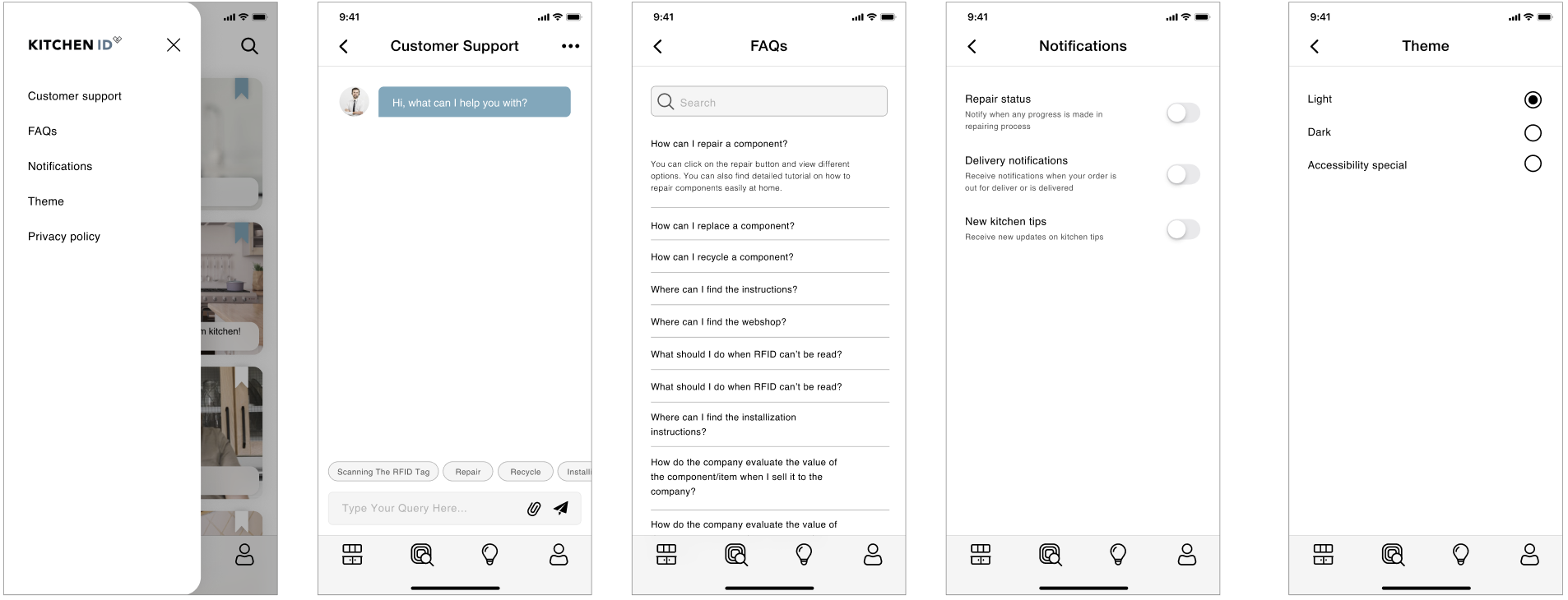
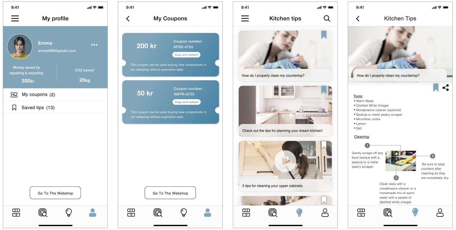
Based on the evaluation results, we made a few more improvements to the interfaces. In the customer service screen, the information arrangement of provided query categories and the messages were more clearly divided up and displayed in the different modules of the screen estate. Modal feedback was added for the important notification. Navigation from mobile App to webshop was simplified. We also did changes to the text or icons that frequently caused misinterpretation during the usability tests. After all these modifications, the final prototype was completed
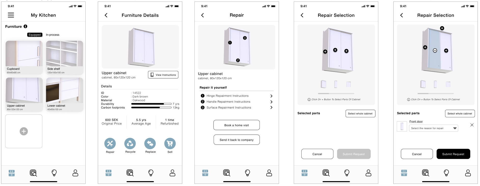
Repairing Furniture Flow
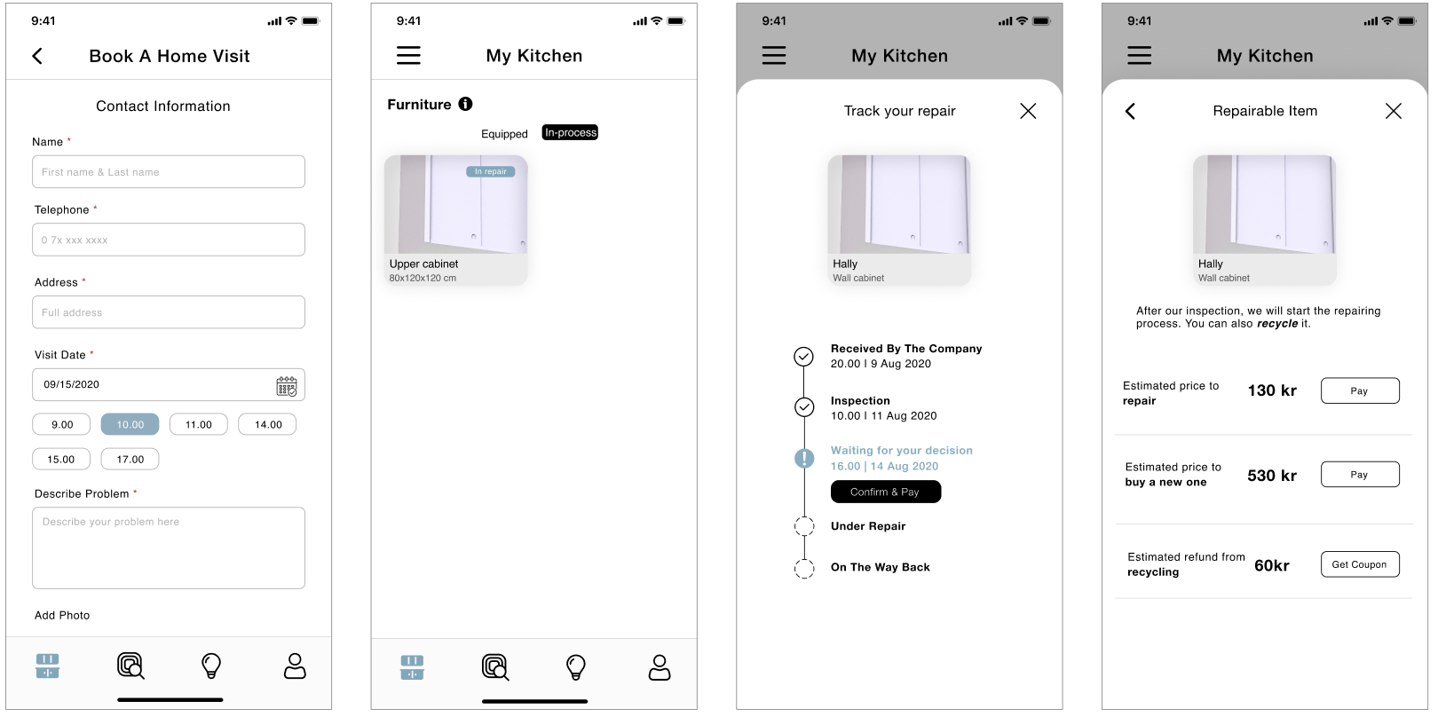
Booking Home Visit & Tracking Process
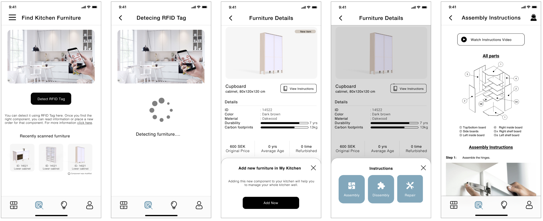
Adding new furniture and finding instructions
User Profile & Kitchen tips
Hamburger Menu
Phase 5
Evaluate
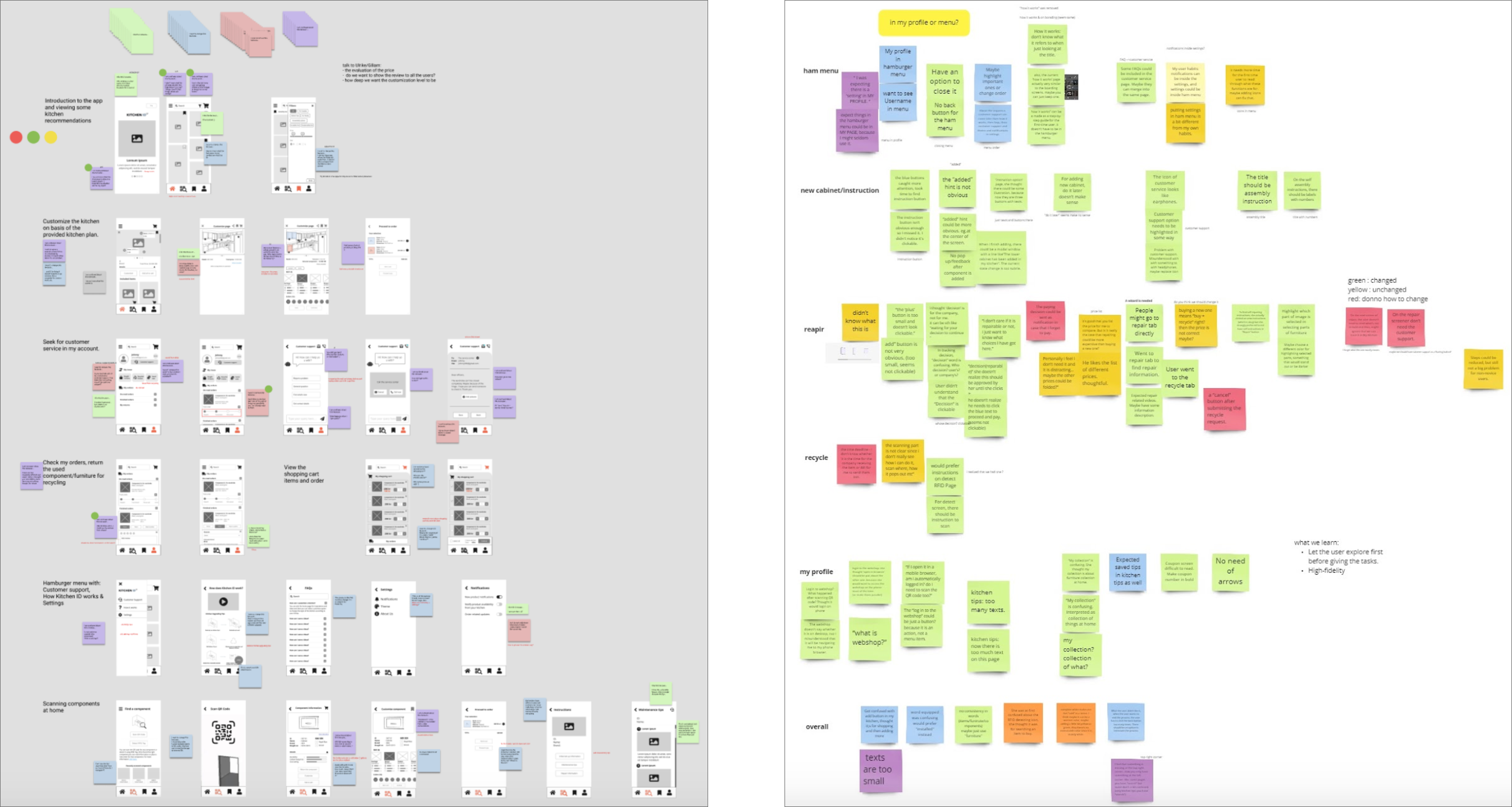
Two rounds of evaluations were carried out for the low fidelity prototype, one was a feedback workshop
with two teachers, another was usability tests with 3 target users . In the feedback workshop session,
two tasks were assigned to the participants, one was card-sorting the features provided by the design team
from most important to least important. Another was reviewing the app features and discussion - participants
were given access to the design document containing the main screens of the app and were given the task to write sticky
notes about the features they like, want to change, want to remove, or confused about. In the usability tests for the low fidelity
prototype, we assigned four tasks representing the four main functionalities which are instructions, repairment, recycle and hamburger
menu. The tests were conducted via ZOOM respectively for each participant and during each test, the participant was asked to think aloud
while executing the given tasks.
For the high fidelity prototype, we conducted usability tests with 9 participants varied in ages and backgrounds in order to get feedback from different user groups. The structure of this usability
test was very similar to the previous one - firstly, the app was briefly introduced to participants; then five tasks were given and participants have to execute them while thinking aloud; after each task,
participants were told to rate the difficulty from 1 to 5, and after all tasks, some general questions were brought up and an open discussion started. Notes from the observation and quotes were put on sticky
notes all over a board (each color represents one user), then Affinity Diagramming was applied to meaningfully cluster the insights.
Both the iterations gave valuable insights and led us to the final design as shown above.
© Copyright © All rights reserved
